Jasmin Reese doesn’t have a lot of time for white-box minimalism. The Chicago-based interior designer, who has been expanding her footprint in Naples, built a career helping people find their true colors, and it’s a duty she takes seriously. “My personal style is colorful and bold—what I would call ‘understated theatricality,’” she says. Reese delights in bringing clients over to the bright side via collaborative measures that help them better understand who they are and what they want their spaces to be. “In the beginning, I’ll do a bit of sketching and bring some magazine pulls for inspiration—images are often worth a thousand words,” the designer says. “I try to understand what their vibe is.”
Once personality, palette and parameters are established, she gets to work, detonating her signature “color bombs” via a mix of wallpapered ceilings, eye-level artwork, bold paint picks, and graphic fabrics in well-balanced rooms that are equal parts convivial and cultivated.
Reese credits her attraction to color to a childhood spent abroad. “I grew up in Germany—my father is American and my mother is German—until we moved to Rhode Island when I was 14,” she says. “I was influenced by the pastry shops, toy stores, shoe stores and art stores. I loved getting a fresh pack of colored pencils with all of the fun, patterned accessories and always felt that the toys there were well made and beautiful.” After arriving Stateside, she studied art before shifting to interior design. Since opening her eponymous firm and design shop in Chicago’s Lincoln Park neighborhood in 2014, she’s been making news with hues.
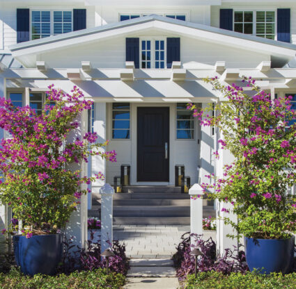
So, it made sense when a couple with a brand-new, very white, 5,100-square-foot, five-bedroom spec townhome came calling in 2021. “The family was relocating from California, and during our initial meeting, they said they wanted anything other than white,” Reese says, with a laugh. “That was kind of the program from the start. They were all about mixing patterns, going bold, and they were already loving wallpaper. They didn’t shy away from anything I threw at them.” While Reese generally creates detailed PowerPoint presentations for clients from out of town, she physically laid everything out for these clients, who flew in for a five-hour presentation. “We had more than 40 rugs to choose from, samples of draperies, wallpapers and high-gloss paint samples,” she says.
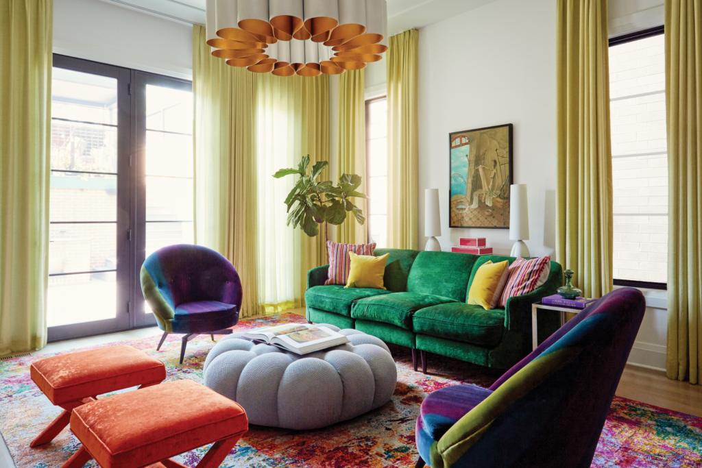
Reese says it was important to set the tone and expectations for the entire home from the jump. Because the living room is visible from the street and is the first room visitors enter, Reese chose a dramatic high-gloss blue for the walls that effortlessly transitions to draperies in the same color. “I personally love that room the most. It’s a true kaleidoscope. I wanted people to experience something soft as they’re coming from the outside,” she says.
The shade works well with changing light throughout the day. “I always let my clients know that they should see paint in multiple lights. Even in rooms that don’t get a lot of natural light, I love to just fold into a dark room, embracing the darkness if the client is open to it, and then incorporating a lot of moody lighting,” she explains.
After the custom color was on the walls, Reese began furnishing with the clients’ antiques, mixing in more modern upholstered pieces, including a white sofa that contrasts the space. She’s not one to sacrifice function over form. “We stain-treat everything to a really high level—these people have children,” she says. “I have a white sofa, and I spill coffee and red wine all the time. We don’t want anyone to have to worry about things like that.”
She also added an eclectic pattern to the back of a pair of simple white chairs. “I sent my client a Pierre Frey wallpaper sample, and she had already pulled the same exact one as a fabric. It was a real meeting of the minds,” the designer says.
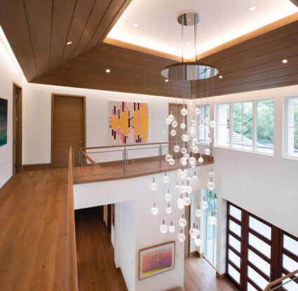
The color and pattern only get bigger and better from there. Around every corner—whether it’s the bee-themed wallpaper on the elevator ceiling, a bright blue bathroom tile, vintage-inspired lighting from Visual Comfort and Curry or the abundance of patterns on the basement walls (the aforementioned Pierre Frey wallpaper makes an appearance)—surprises abound. An upstairs bar area, known as the “three seasons” room, feels like a conservatory thanks to bountiful plants, floral wallpaper and a verdant Roche Bobois sofa. And, the reading room is bespoke, with its Paris-inspired mural that Reese and her team painted.
There was only one element that Reese was nervous to introduce during the nine-month project: the Missoni fabric she chose for the stairs. “It’s a little out there, but luckily, the clients just loved it. It provides nice traction with white walls,” she says. That’s right: There are a few white walls here. Reese chose Benjamin Moore Chantilly Lace to show off some of her client’s art collection. “It’s a crisp, linen-like white that has just a tinge of blue—perfect for bouncing light around.” Still, Reese notes that the artwork didn’t dictate the overall direction of any particular space. “The homeowner definitely wanted the portrait of the girl over the fireplace in the living room, but other than that, we had total freedom,” she says. “She’s a real art collector, so she didn’t need us to curate the rooms around the pieces. The art is its own thing.”
With the townhome complete, Reese has since moved on to other high-gloss, high-profile projects both in Chicago and beyond. “Our goal is to work more in Naples and throughout Southwest Florida. I’m looking at places down there, and I’m excited to get to work,” she says. While the climate couldn’t be more different than the Midwest, her aesthetic is perfectly suited for the landscape. “When you’re at the beach and working on a first, second or third home, it’s a great opportunity for reinvention. Why wouldn’t you do something different than what you’ve always done?” she asks. “It’s the right time and place to be a little bolder and have some fun.”


Photography by Michael Alan Kaskel